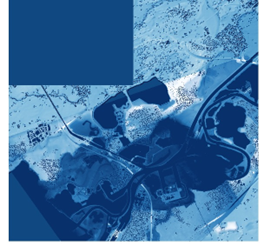
Relative Elevation Model
Using open data from Utrecht City and GeoTiles to create an REM of the river, Maas, through Roermond
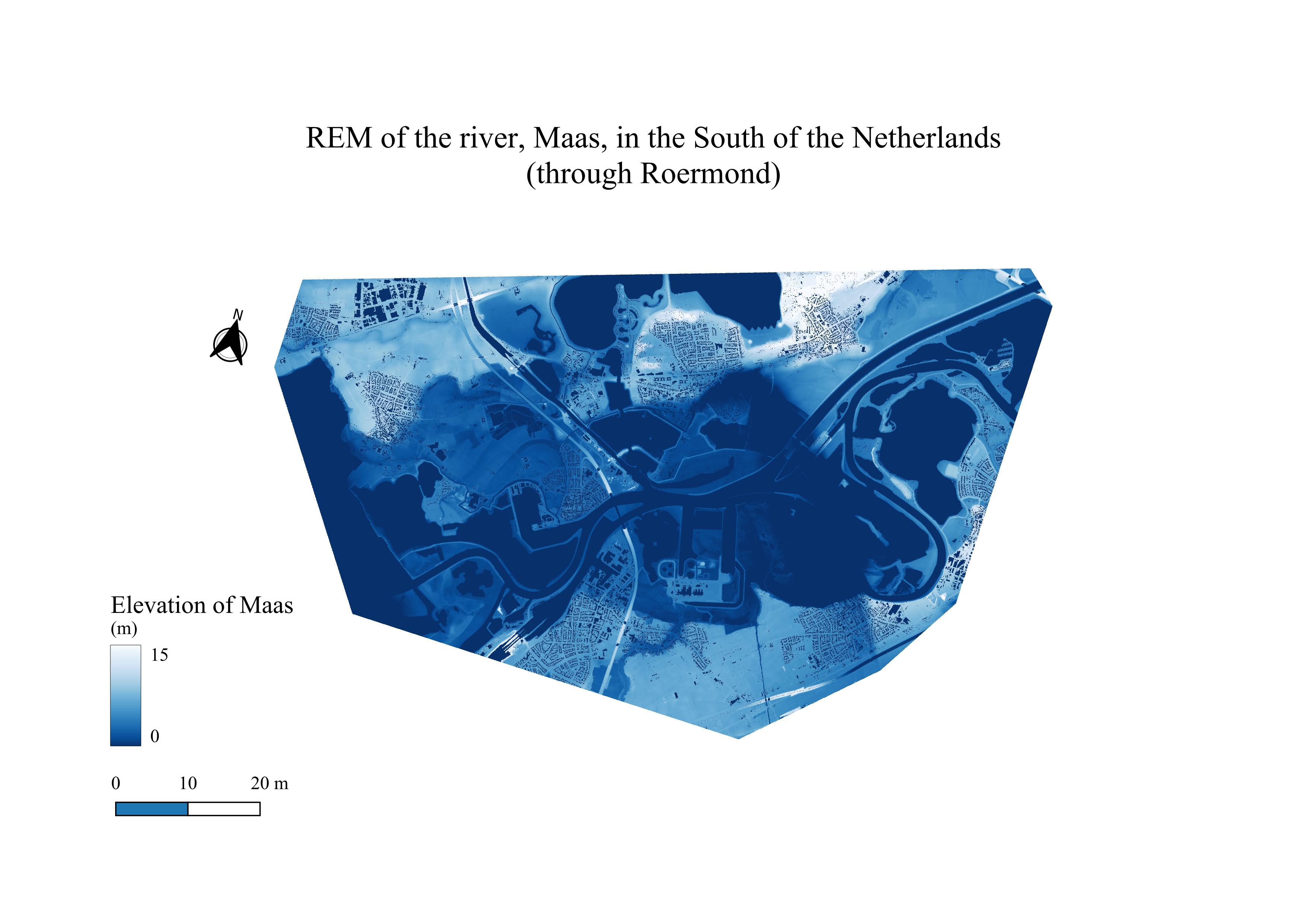
What is a relative elevation model?
A relative elevation model is a model which shows the elevation of an area (usually of a fluvial plane) in relation to the river (or what used to be the river). It can be useful to understand how the land has changed over time due to the path/course of the river.
How did I make this map?
In order to make this map, I chose an area in the southern region of the Netherlands where the river looked "wild". This turned out to be the Maas river, running through Roermond, De Weerd, Osen, Ool, and Maasbracht. I downloaded the
DTM
A Digital Terrain Model is a model that contains a stripped visualisation of the terrain - stripped of the buildings, trees, etc.
of my chosen area using the GeoTiles website which sources open data (like LiDAR point clouds). Afterwards, I used this tutorial to compute raster calculations - using TIN
Triangulated Irregular Network - an interpolation method that uses that Delaunay triangulation that creates a surface formed by triangles of nearest neighbour points.
to interpolate the relative elevation of the area around the river based on cross-sections that I made along the river banks. I set the river to have an elevation of 0 and all of the other points of elevation of the terrain around the river are calculated in relation to this value.
Focusing on the stylistic/artistic side of creating this map: I chose the colour scheme of inverted blues and a stretch of 0-15 because it highlights all the complexities of the different elevated points throughout my area of interest. I noticed that when the stretch was smaller, the values became somewhat aggregated and the higher elevated land was all really white, indicating that it was all the highest possible elevated land from the river. However, this turned out not to be the case when I increased the stretch. As such, from this colour scheme and stretch, you can clearly see that this map appropriately conveys that the Netherlands is quite flat because the majority of it is either dark blue or closer to a dark blue.
Obstacles encountered and skills I learnt as a result:
- Running TIN: Not only have I learnt how to make cross-sections, I have also learnt how to use those cross-sections to run a TIN analysis in ArcGIS. Whilst the TIN analysis ran very well, I wished that I had edited the map's outline a bit more as it looks a bit odd.
- Raster calculations: I have gained a stronger understanding in the different raster calculations available to the downloaded raw data.
- Art of cartography: This assignment emphasised learning the art of cartography and specifically, how to focus on making stylistic choices in order to appropriately create aesthetically pleasing maps.