Choropleth
Visualising data from SDG indicators 15.1.1 and 14.5.1
What is a choropleth map?
A choropleth is a thematic map which uses colour gradients to represent quantitative data of entire countries (or at least within political boundaries). Some advantages of this map are that it can be used to graph governmental activities, policies, and regulations for political jurisdictions; they are relatively easy to make and are thus, quite popular in the media. Some disadvantages are that they generalise a lot of the data, so they create an aggregate of data, and thus, can create a misrepresentation of the data in a country (i.e. suffers from modifiable areal unit problem); the gradient of the colours affect the reader’s understanding of the map: the darker colours attract the reader’s attention first and because of the normalisation of the data, they might occupy a larger range of data than lighter colours, creating a misrepresentation of the values for certain countries.
How did I make this map?
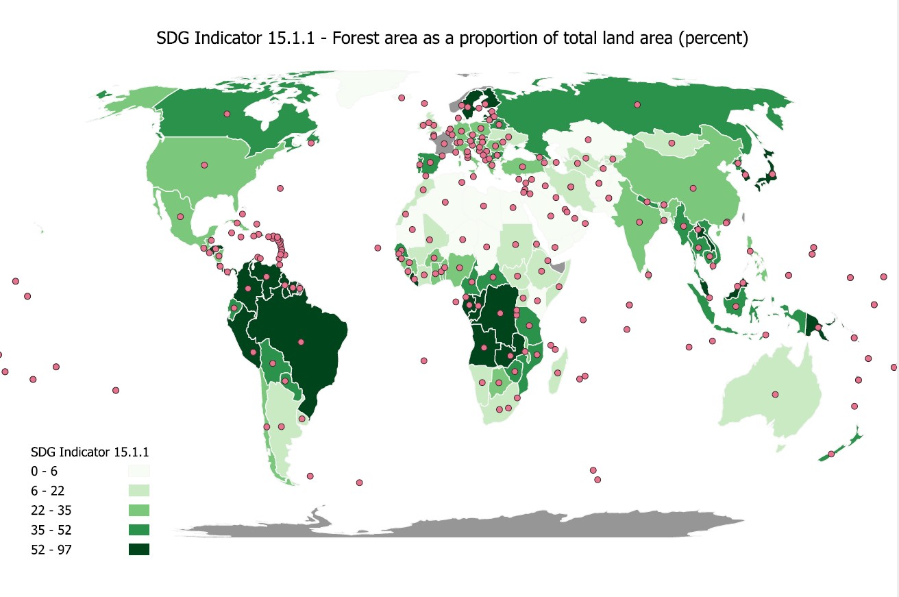
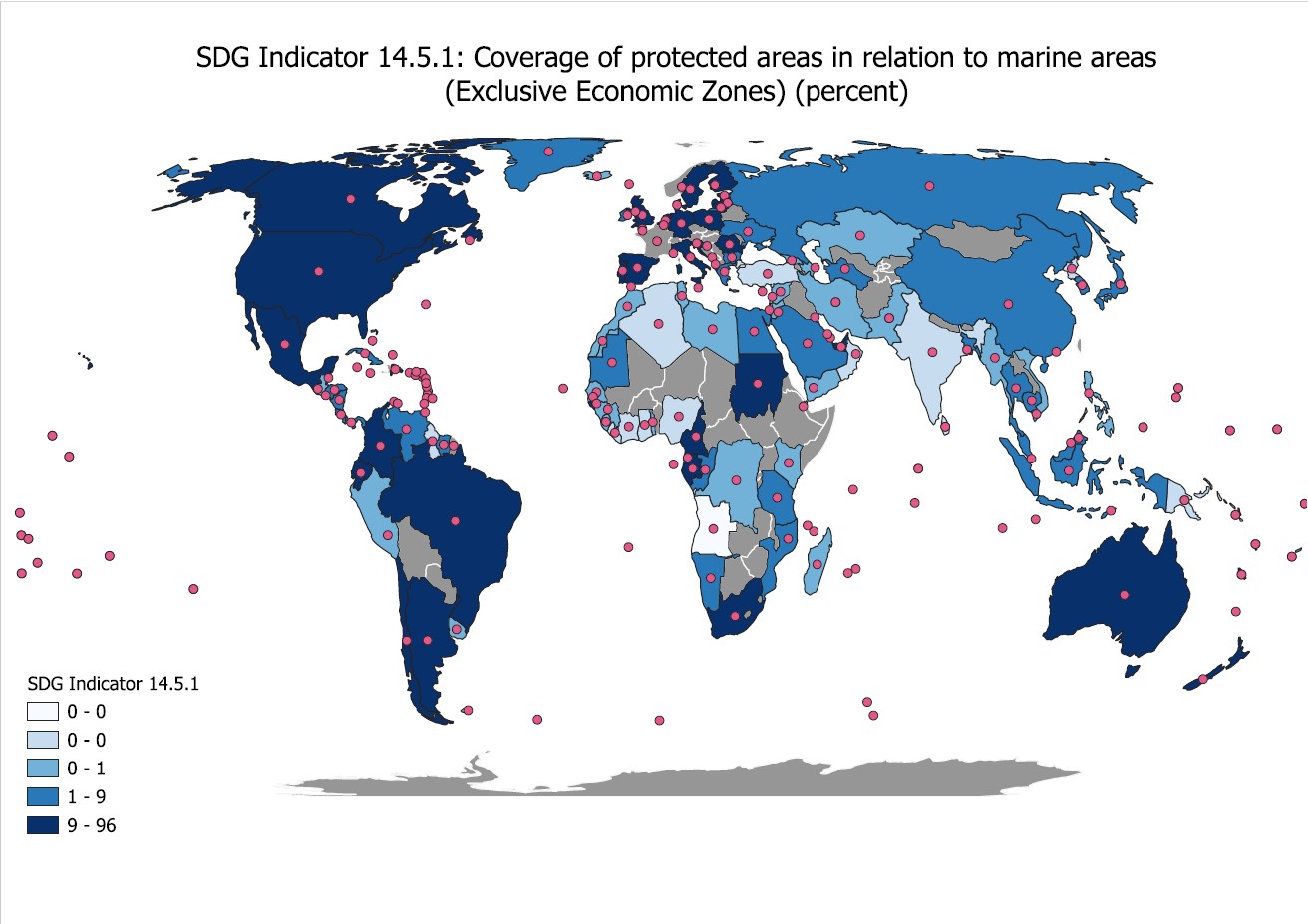
To create this map, I had to join the clean global data sheet layer and the data from my indicator (in the first example, it would be SDG indicator 15.1.1 and the second, 14.5.1). After joining the layers and ensuring all of the values lined up with the corresponding years and countries, I then made a choropleth map by changing the symbology of the map and choosing a graduated ramp. I chose the colour scheme of green for SDG indicator 15.1.1 because the indicator targets the forest area as a percentage of total land area and green seemed the most appropriate for trees. I then chose a blue colour scheme for the second indicator, 14.5.1, because this indicator targets the measure of protected areas in relation to marine areas and blue is appropriate for water. Although it does look slightly odd that blue is placed on the continent rather than the water, it certainly creates a contrast to the green when put in a slide map of the two choropleths.
Once I had both of the choropleth maps created, I uploaded them both onto Esri Online and I created a "Media Map" app wherein I inserted both maps as layers onto one single map and enabled the swipe tool to create the above app.
Obstacles encountered and skills I learnt as a result:
- Choosing data: when I was choosing the data for my choropleth map, I had trouble often finding a complete data set. When I looked at the UN Stat Data online, some countries did not submit their data for certain indicators and when they did, it was usually for the year 2019 and not earlier or later. This made it quite difficult to create a choropleth map because then you could not see values for any country and they could be falsely read as 0 for a value when in fact it was just missing. I overcame this by learning how to go into the attribute tables and reading/understanding the data and cleaning it up.
- Data joining: joining the data layers was difficult because some information was missing and I needed to join the right target and join fields in order for the data layers to appropriately join. After trial and error, I learnt how to join the right fields (in the end it was the ISO_A3 fields).
- Uploading maps to Esri-Online I learnt how to export the layer as a feature layer which I then uploaded onto Esri online.
- Making a web app: I learnt how to make a slider map using the web app function in Esri Online. It was challenging at first because I thought the slider map would allow me to slide between the two maps (as in, have it trail and overlay each other). But after finding out that was not what I planned to do, I experimented with other web apps until I found "Media Map".